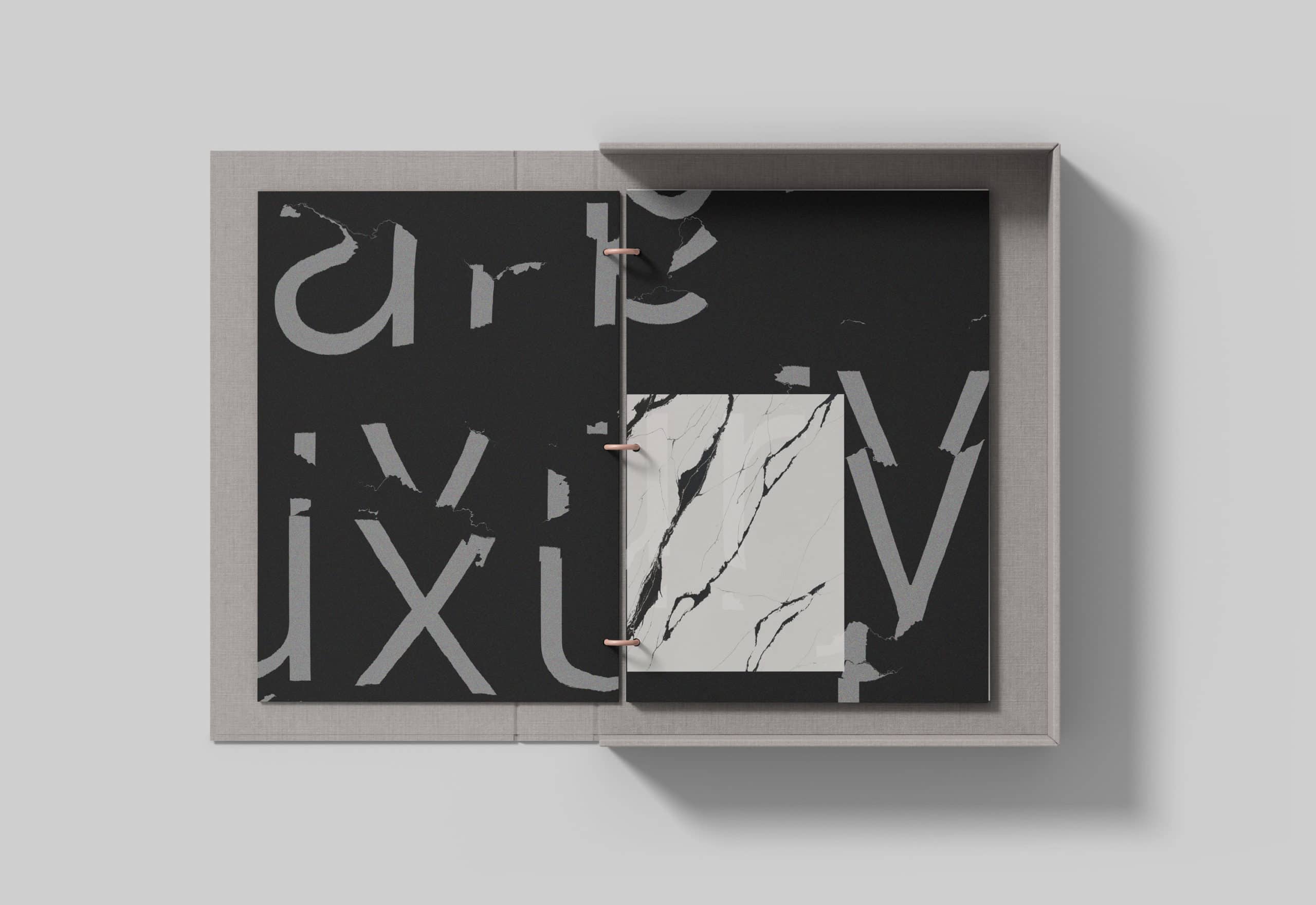
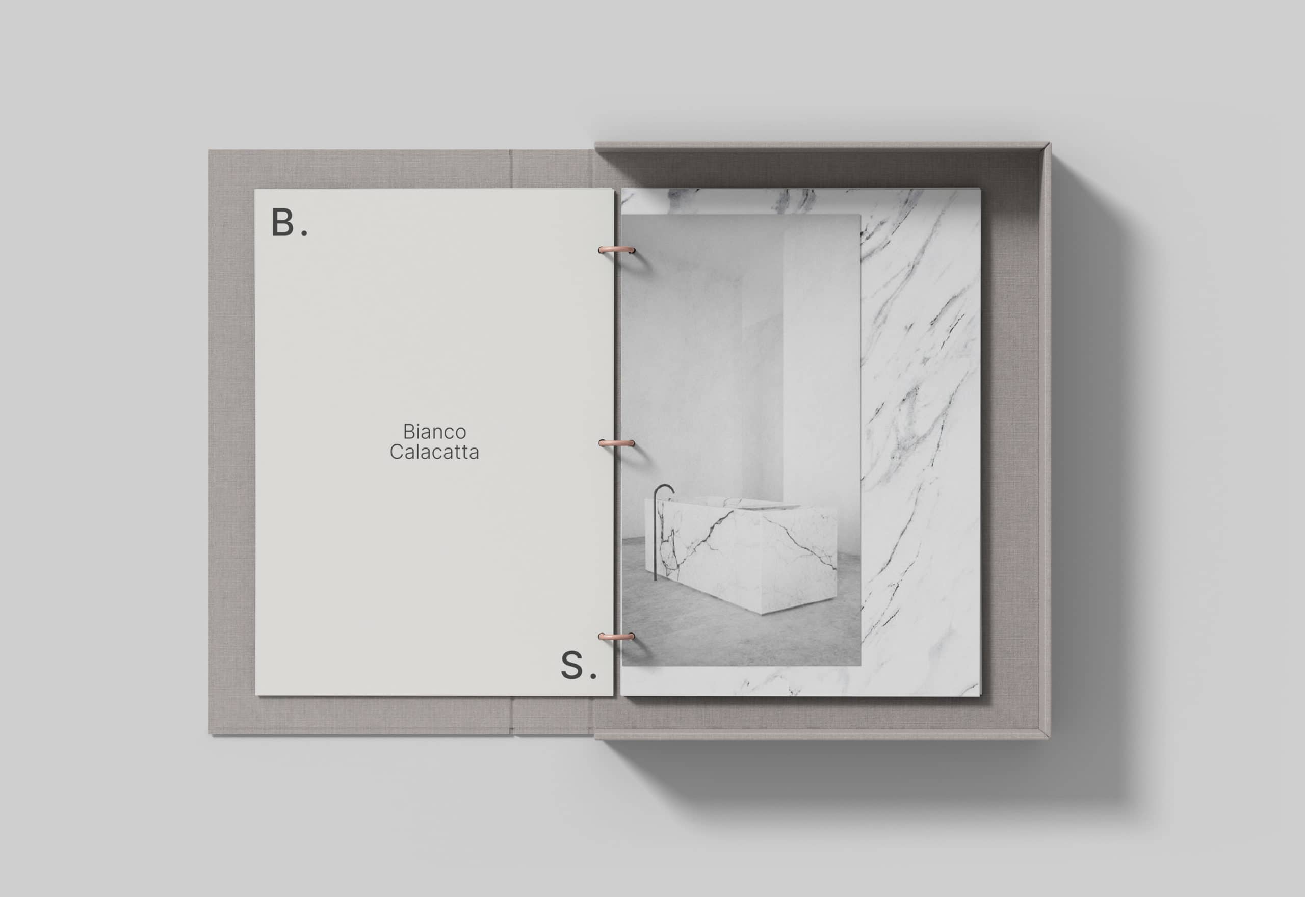
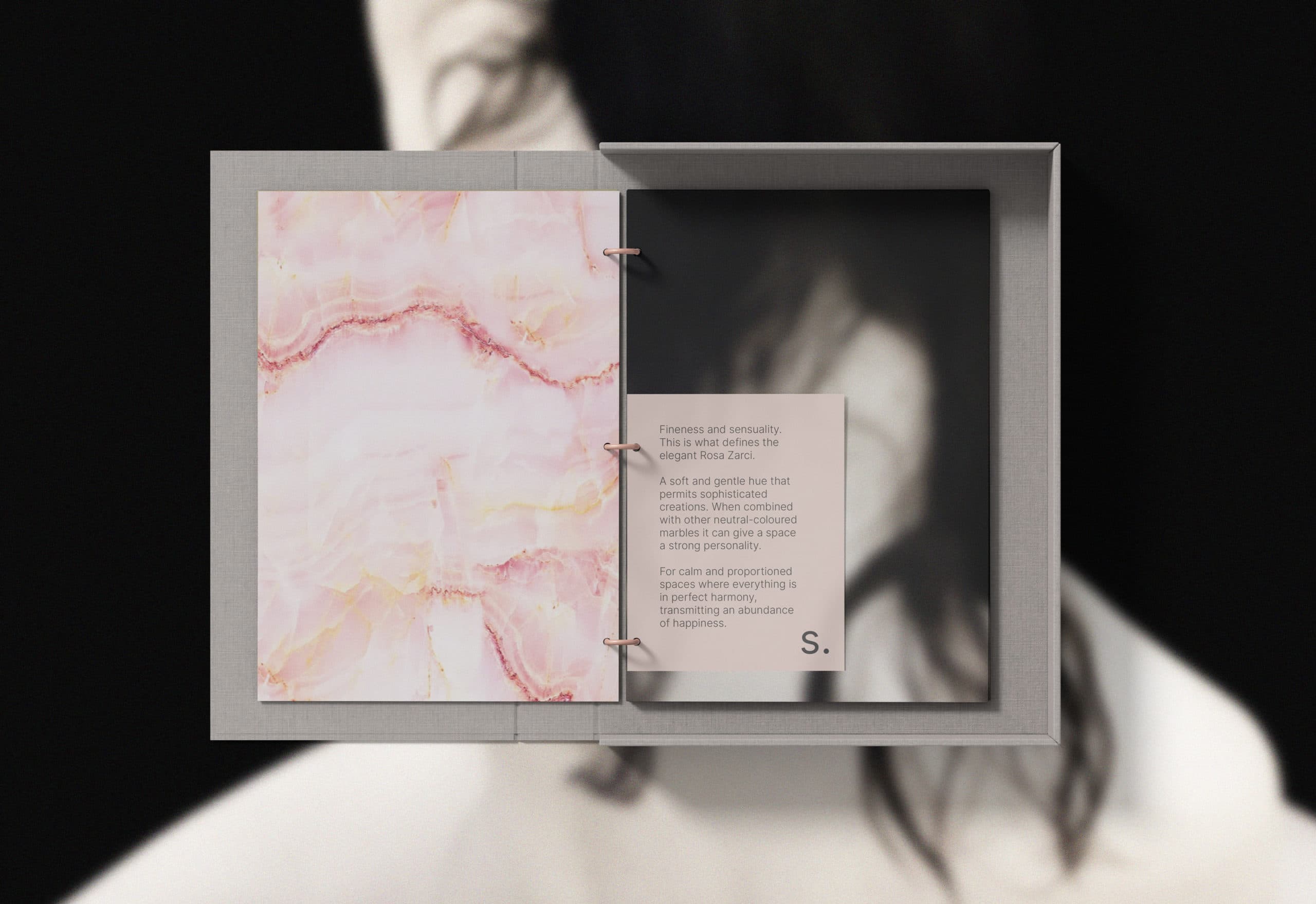
Crafting a distinctive visual language for the catalogue required a focus on the marble’s inherent qualities, textures, and intricate details. The design strategy was simple yet elegant, employing storytelling and familiarity to make the essence visibile.
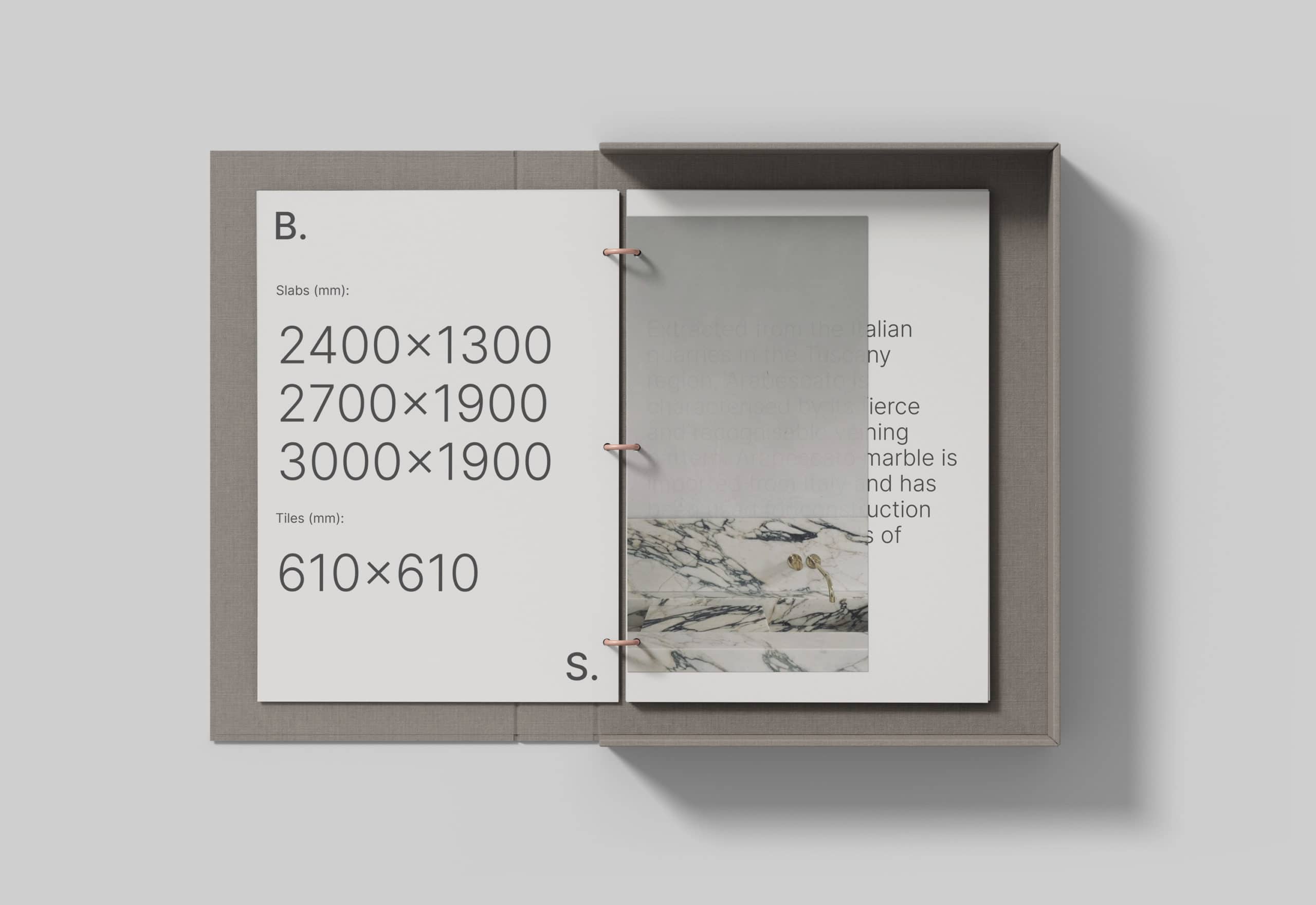
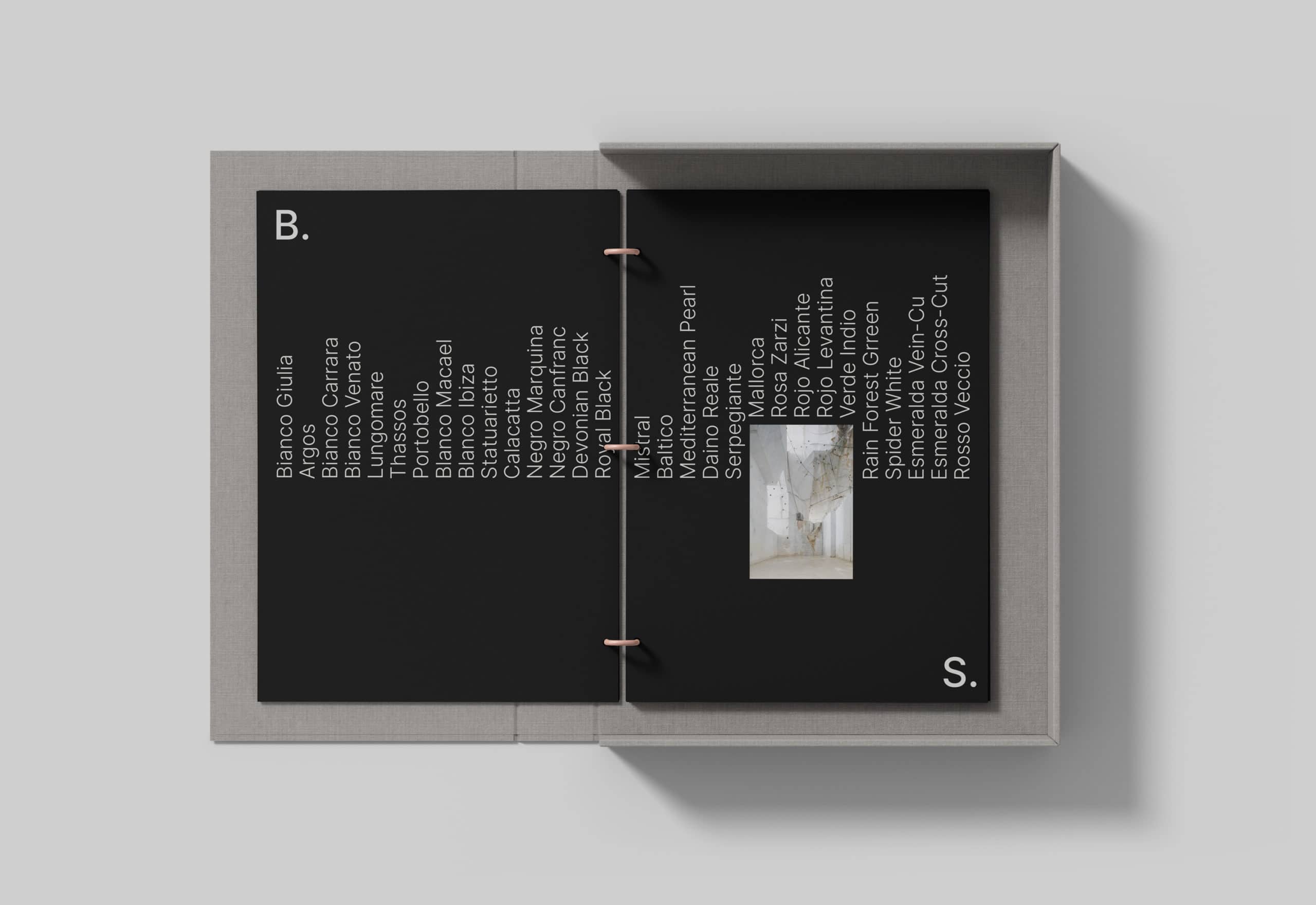
Typography served a pivotal role. Clean, minimalist lettering, ample white space, and bold titles ensured the marble’s characteristics remained the focal point. The layout was thoughtfully engineered to guide the viewer seamlessly through the reading journey.
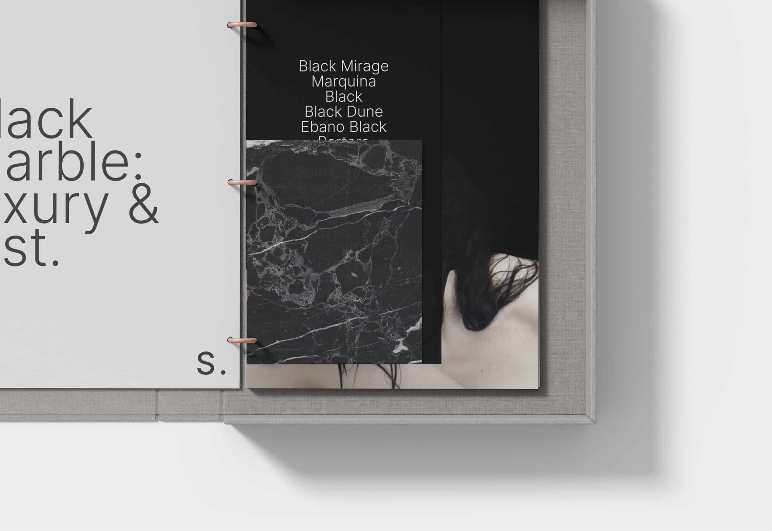
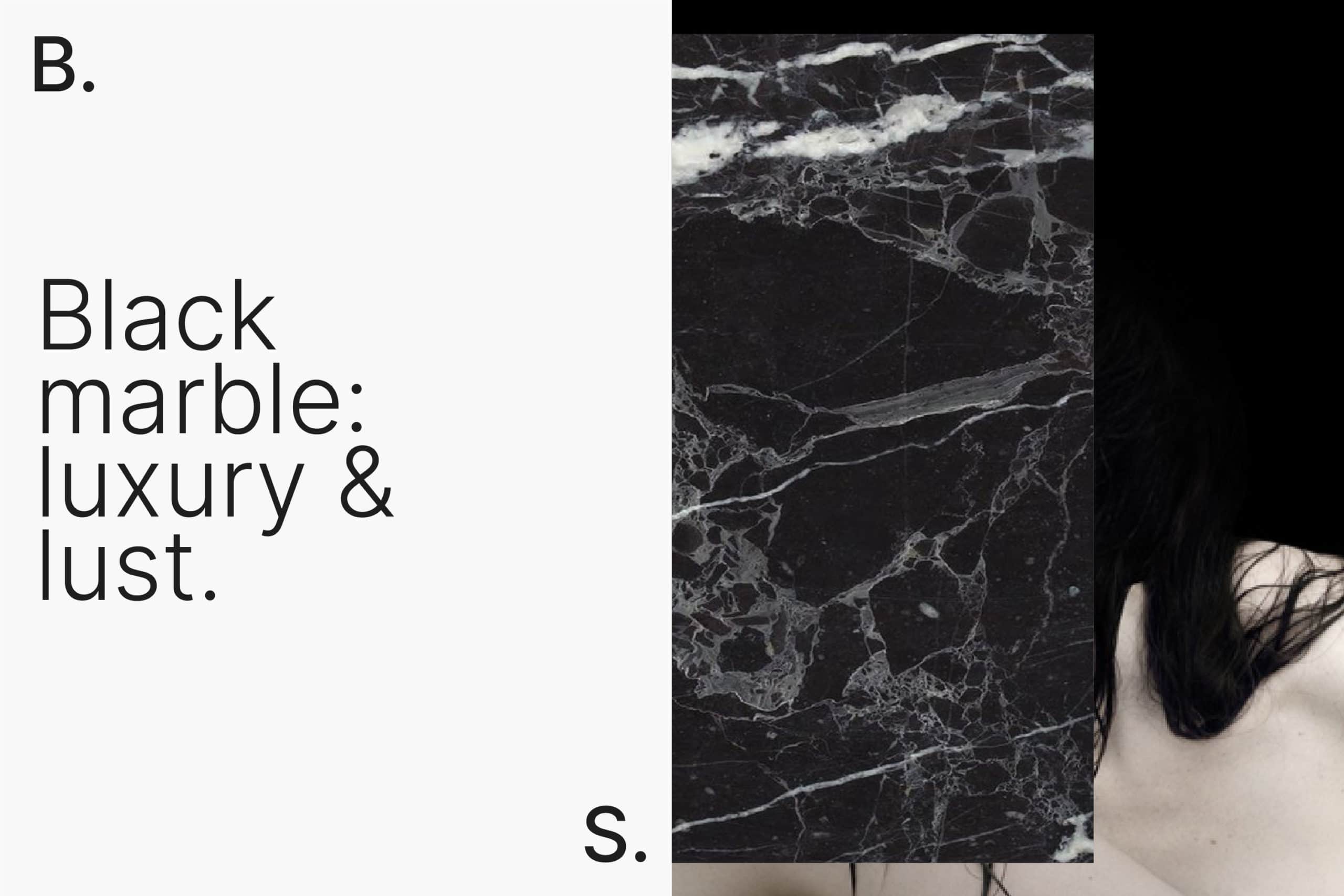
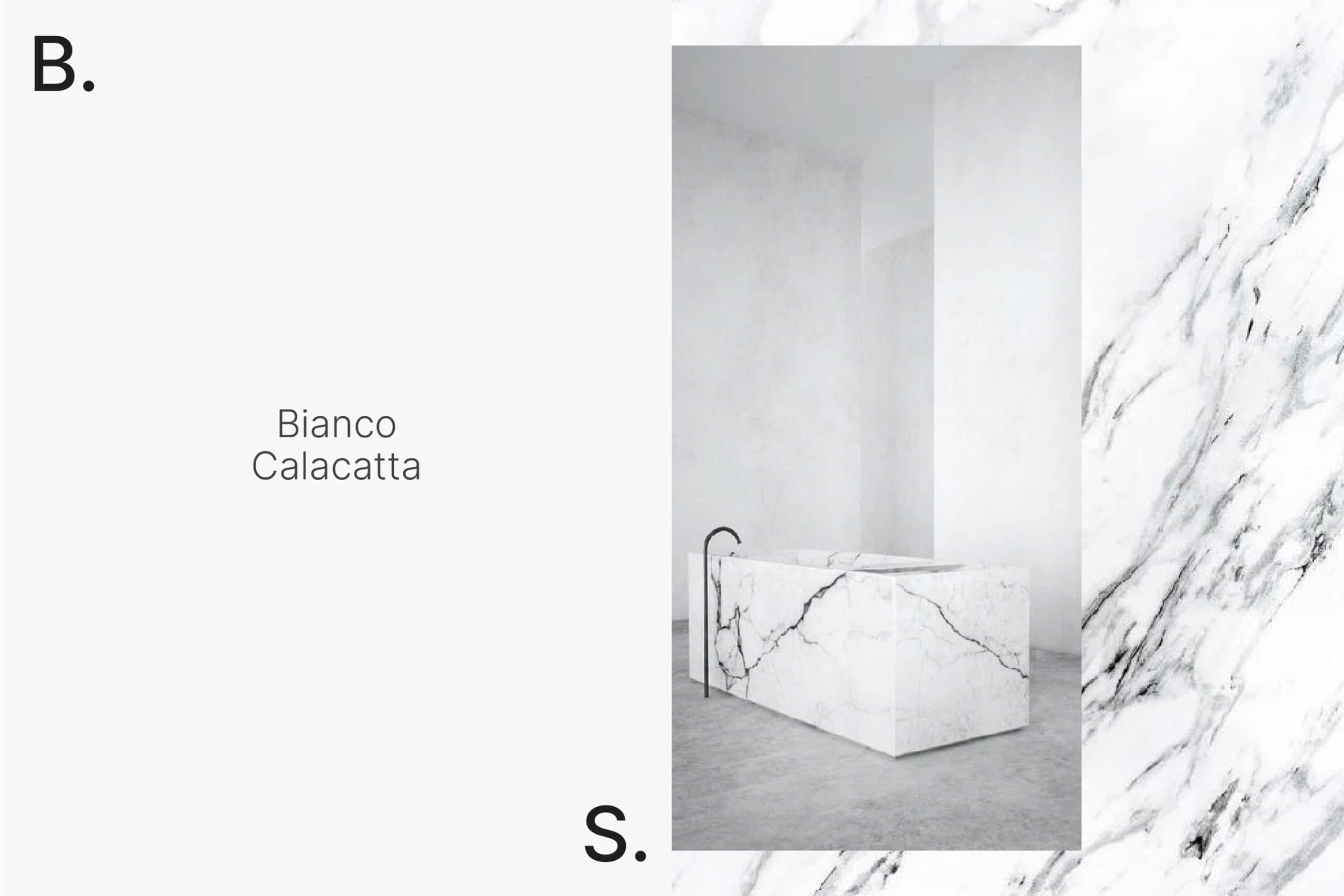
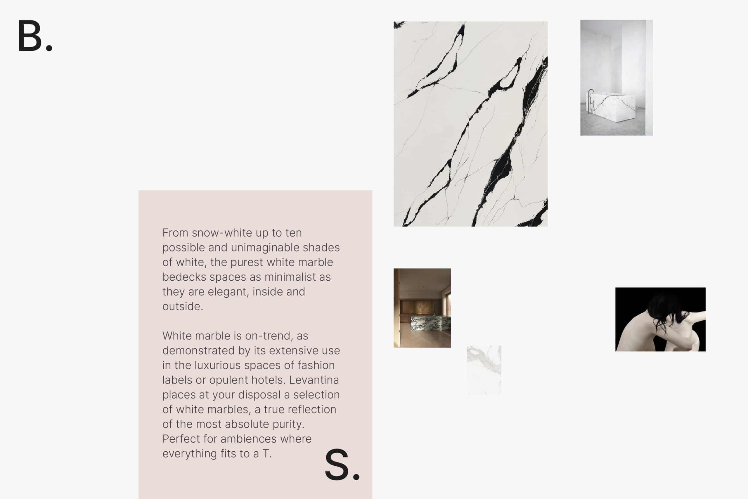
At the heart of the photography was a poetic approach. We juxtaposed detailed shots of marble textures with images echoing the human figure. This pairing aimed to portray the stones as living, breathing entities.
Through the interplay of typography, strategic layouts, and thoughtful imagery, we reimagined the perception of marble. Highlighting its inherent elegance, raw materiality, and variations, we offered a fresh perspective on this timeless material. The result is an intuitive connection to the stones, establishing a unique aesthetic that captivates the viewer.