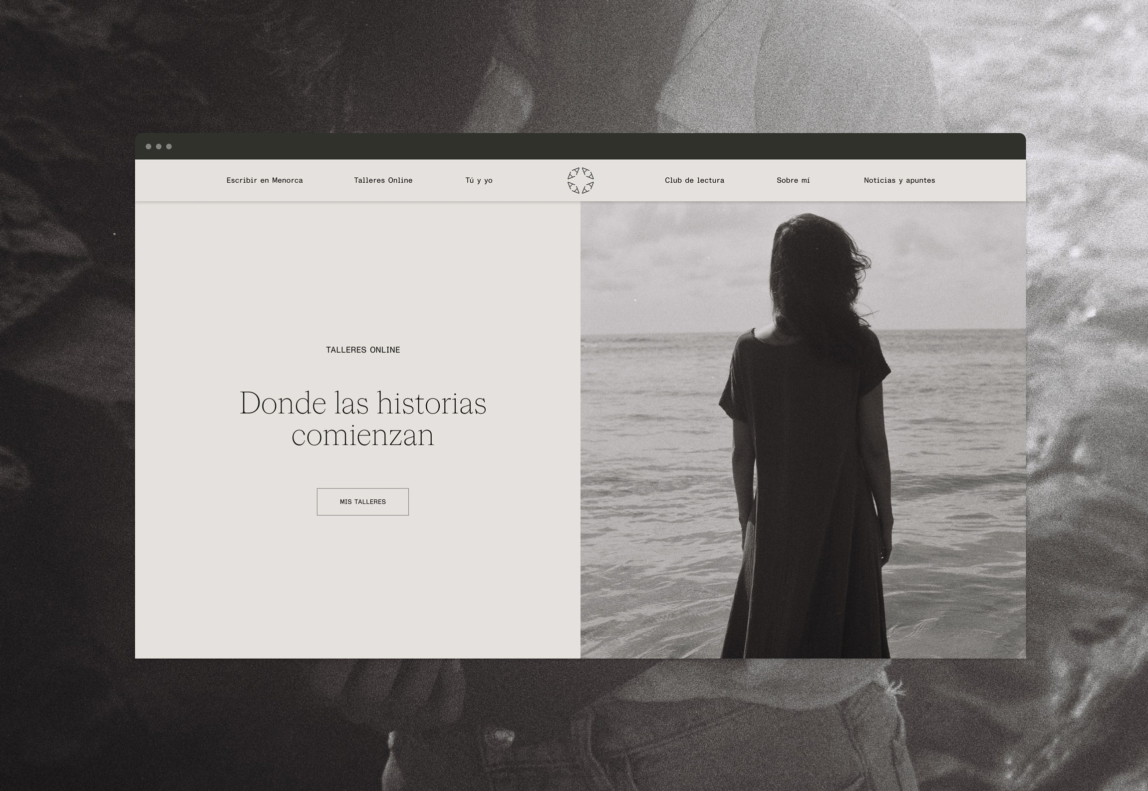
Crafting a writer’s visual identity


Ana Haro isn’t just a creative writer; she’s a Menorca-inspired storyteller who guides others through the maze of words. As a journalist, editorial corrector, and literary workshop coordinator, her multifaceted expertise shapes narratives that resonate. At Unconform Studio, we’ve embraced this richness to forge a brand identity that’s as clear and impactful as Ana’s vision.


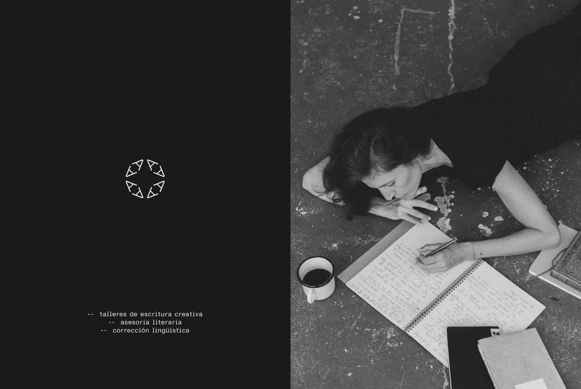
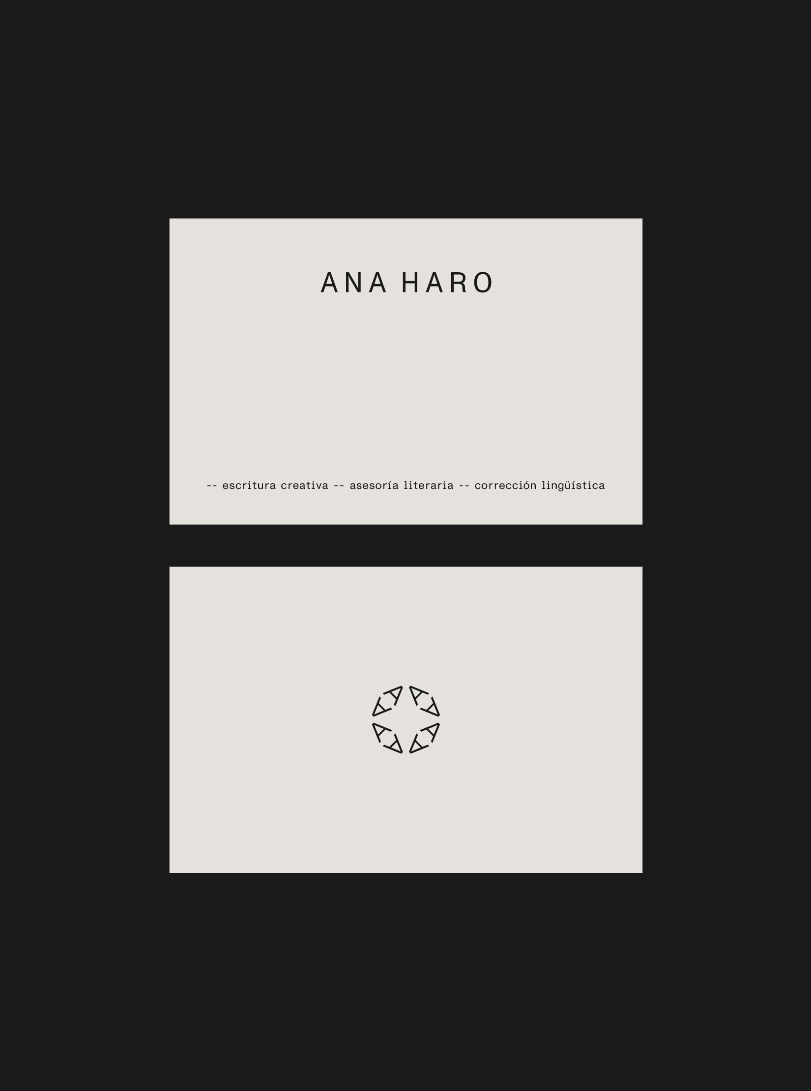
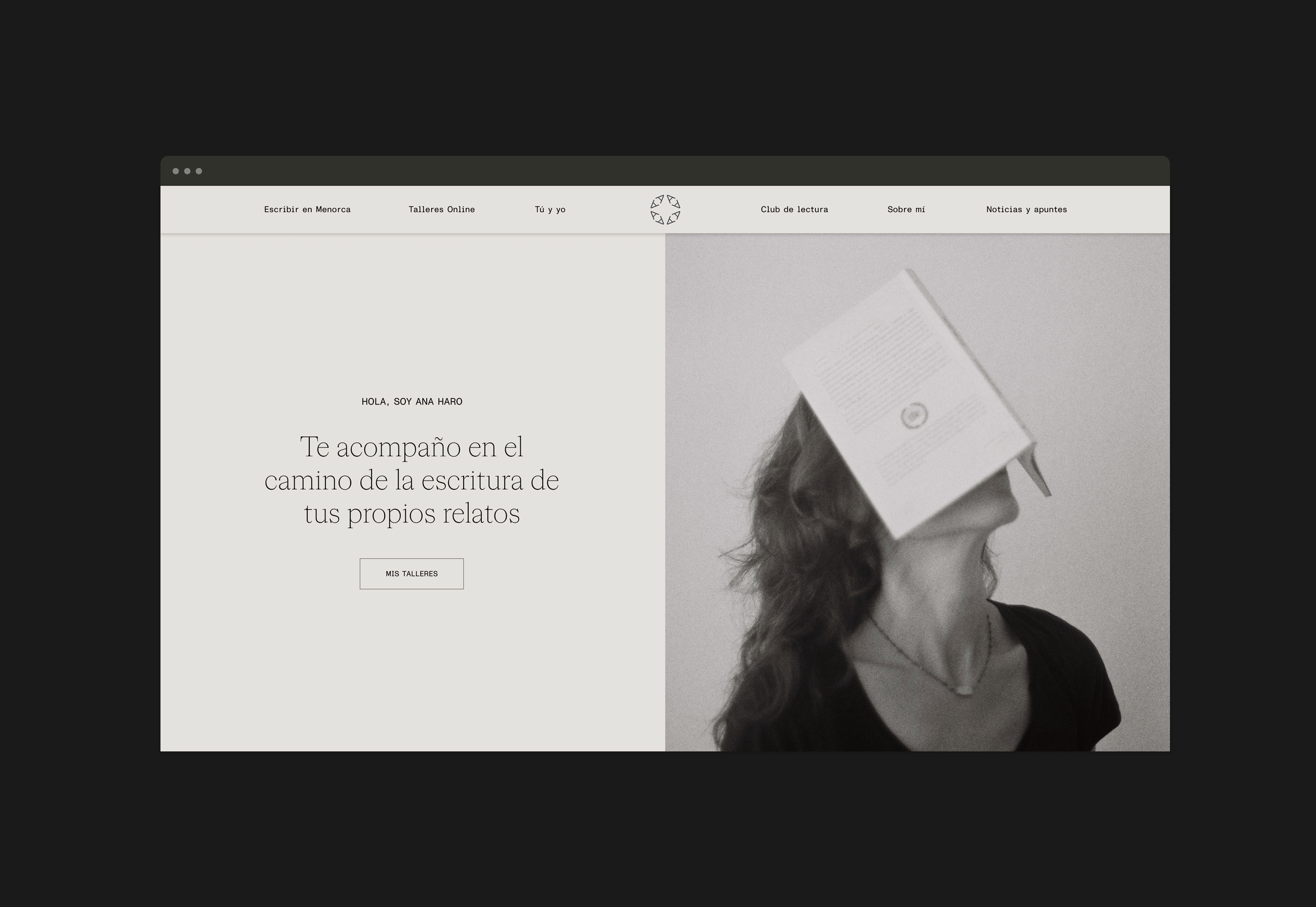
Our logo is a stark, modern emblem that captures her narrative prowess in a strong, minimalist design. Integrating the initial ‘A’ of Ana’s name with the circular motif that represents community and continuity, it forms a logotype that is as resonant and enduring as the stories she weaves. This design ensures Ana’s brand identity remains consistent and striking, whether displayed on a digital screen or printed material.

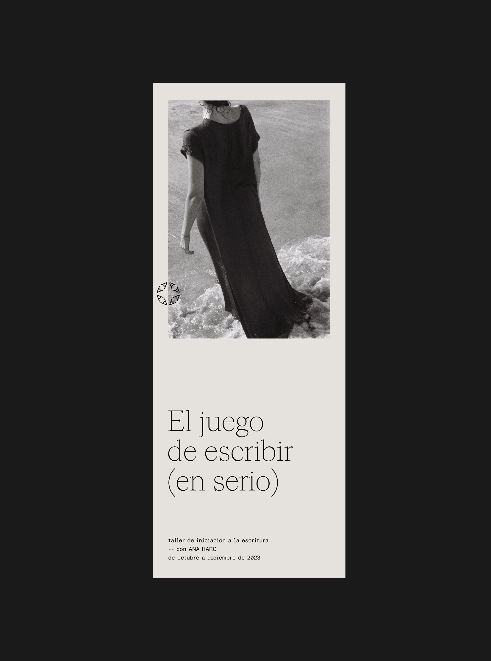
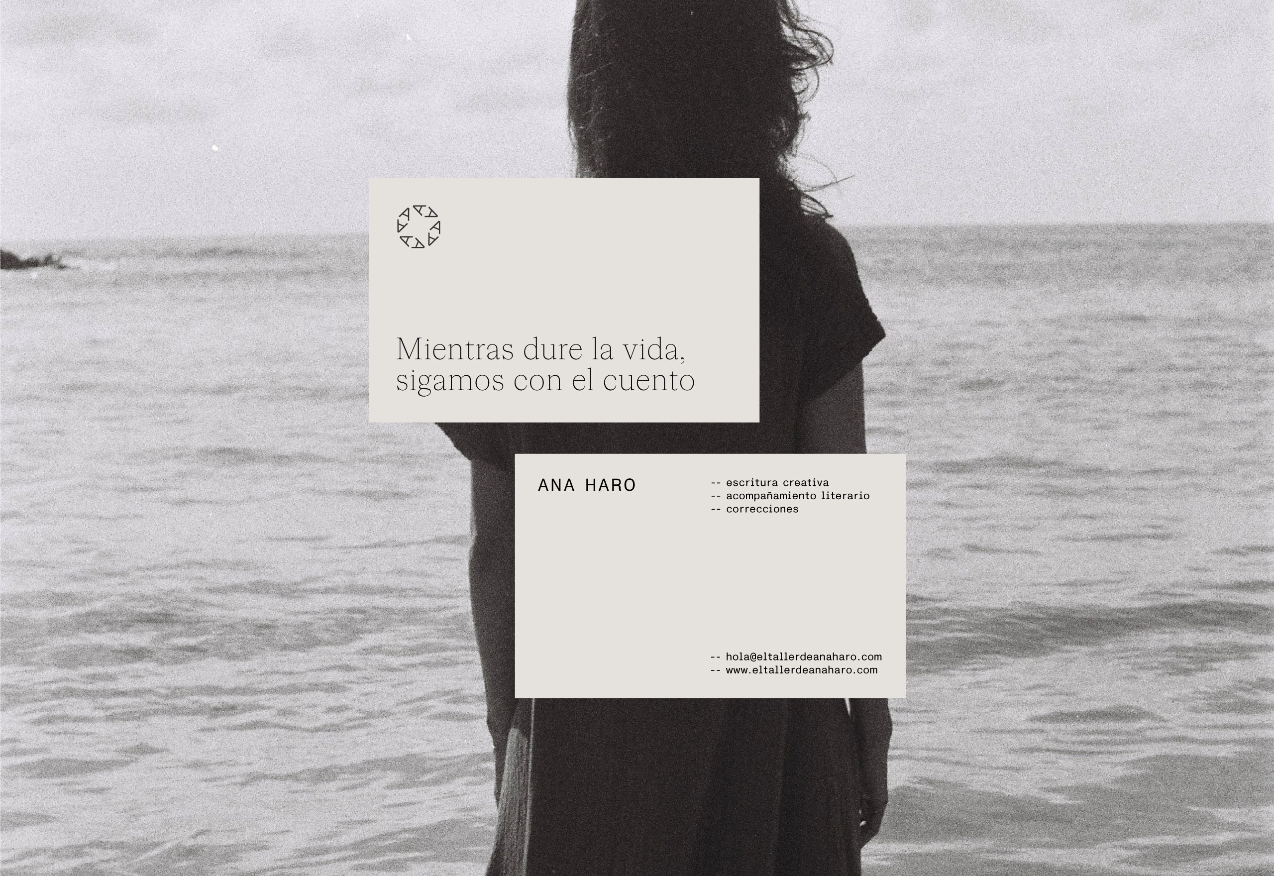
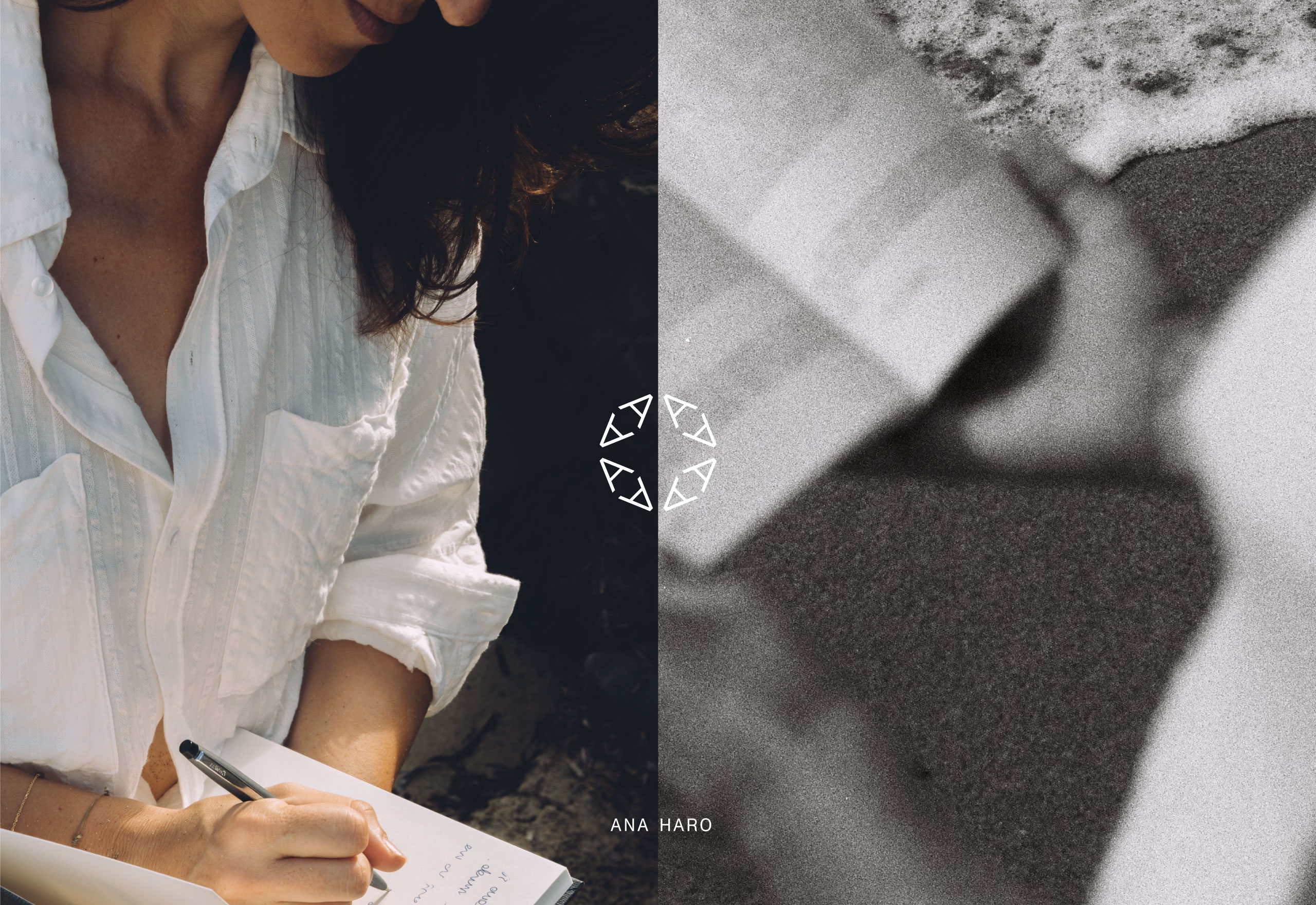
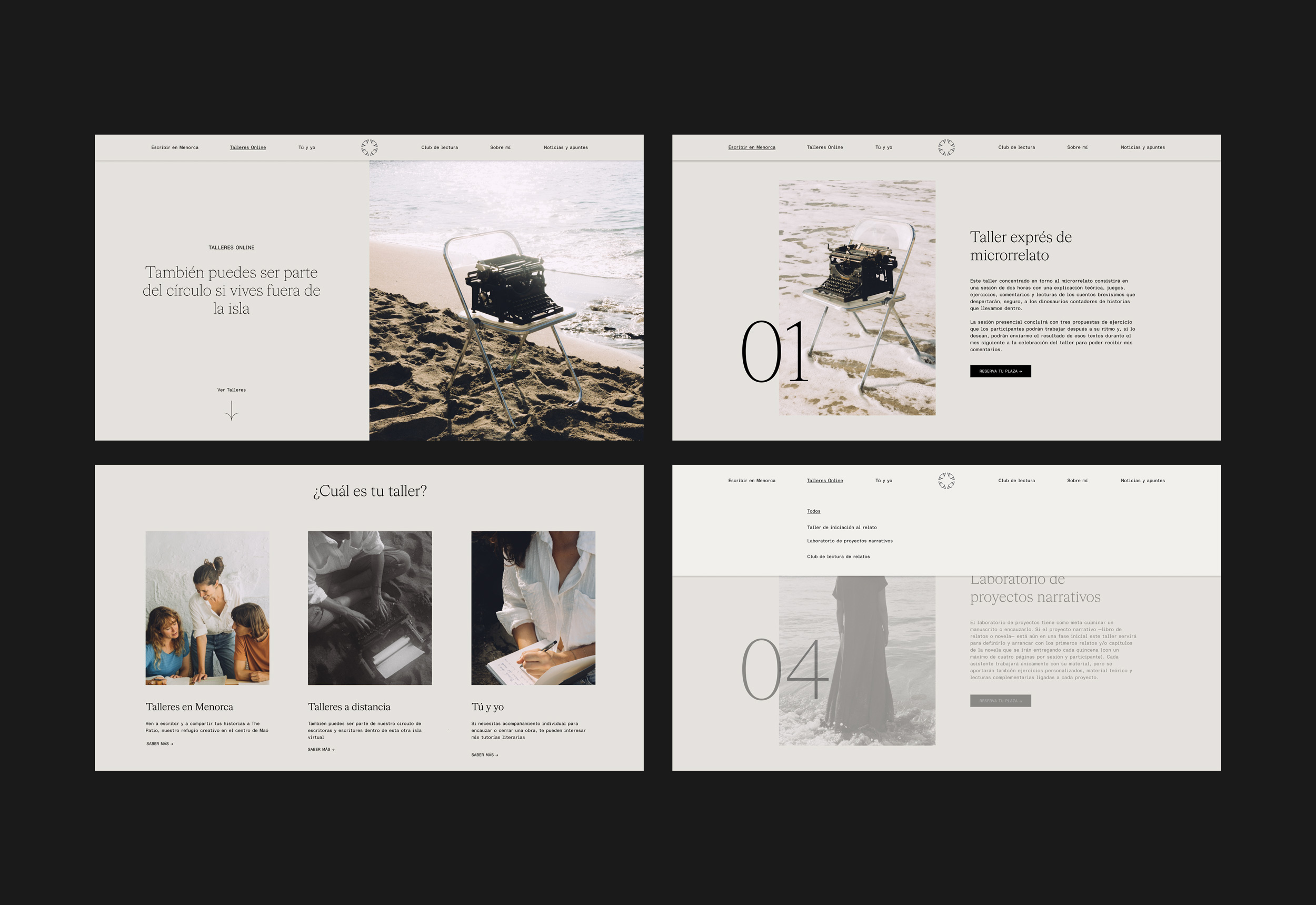
Collaborating with Brazilian and Balearic-based photographer Jessica de Lima, we’ve harnessed the classic feel of analog photography to reflect Ana Haro’s storytelling. The grains and textures in each photo bring Ana’s narrative world to life, combining a mix of black and white with selected color images to weave a visual fairytale. This approach underlines Ana’s identity, balancing between the vivid imagination of her tales and the stark reality she portrays.